A comprehensive, reality-driven look at where branding is actually going
The Big Shift: Logos Aren’t Just Designed—They’re Engineered to Survive
The most important insight going into 2026 is this:
Logos are no longer primarily aesthetic—they’re functional systems built for speed, adaptability, and recognition.
According to Web Designer Depot, the modern logo isn’t judged by how it looks in a presentation—it’s judged by how quickly it can be recognized in a crowded, fast-moving digital environment. (Medium)
We’re designing for:
- App icons (16px–48px)
- Favicons and browser tabs
- Social avatars
- Motion environments
- AI-generated noise saturation
This creates a fundamental pressure shift:
clarity > style, recognition > decoration, systems > single marks
1. Recognition at Speed (The Core Principle of 2026)


The biggest takeaway from current industry analysis is simple:
👉 If your logo doesn’t work at tiny sizes, it doesn’t work at all.
Designers are increasingly testing logos as:
- Single-color icons
- Favicon-sized marks
- Ultra-compressed mobile views
This reflects shrinking attention spans and interface-first branding. (Medium)
Implication for designers:
- Strip away detail aggressively
- Focus on silhouette and contrast
- Build logos that are instantly readable in under a second
2. Neo-Minimalism (Less—but Sharper)


Minimalism isn’t dead—it evolved.
“Neo-minimalism” focuses on:
- One strong visual idea
- Clean geometry
- Strategic use of negative space
Instead of flat, boring logos, brands are using minimal structure with intentional impact. (wix.com)
What’s changed:
- Fewer elements
- Stronger contrast
- More deliberate composition
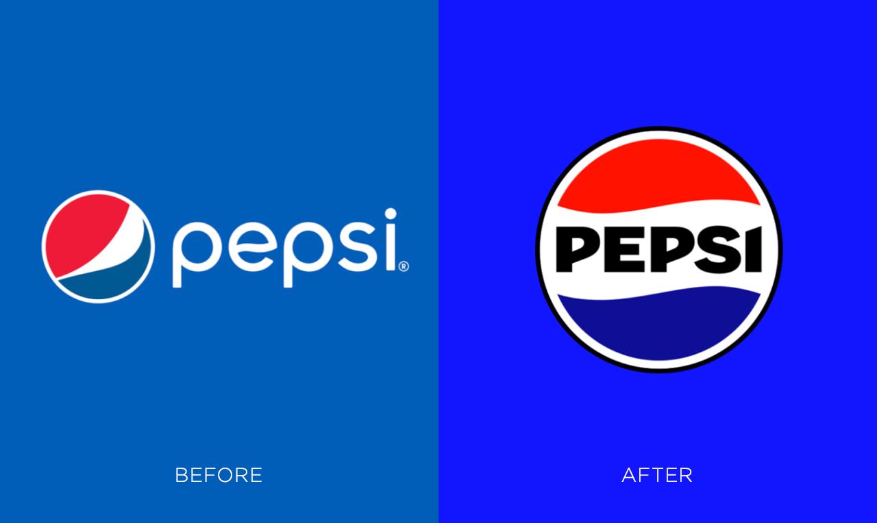
3. Adaptive & Responsive Logo Systems


Static logos are outdated.
In 2026, brands operate with logo systems, not single files:
- Full logo (desktop, print)
- Icon version (apps, favicons)
- Abbreviated marks (social)
- Animated/motion variants
This ensures consistency across platforms while maintaining flexibility. (wix.com)
Key concept:
Your logo isn’t one design—it’s a family of assets.
4. Anti-AI Aesthetic: Human Imperfection Returns


As AI-generated design floods the internet, brands are pushing back.
Major trends include:
- Hand-drawn elements
- Rough edges and textures
- Imperfect typography
- Asymmetry and “messiness”
This creates authenticity and emotional connection. (wd-strategies.com)
Why it works:
People are starting to recognize AI-generated visuals—and they’re craving something real.
5. Dynamic, Living Logos (Motion & Generative Design)


Logos are no longer static—they’re interactive and evolving.
Key directions:
- Kinetic typography (logos that move)
- Generative morphing (logos that change form)
- Context-aware branding (time, user, platform)
This transforms logos into living brand systems. (wix.com)
6. Retro-Futurism & Pixel Precision


Designers are blending nostalgia with modern clarity:
- 80s/90s digital aesthetics
- Pixel grids and sharp edges
- Retro color palettes with modern polish
This trend acts as both:
- A rebellion against soft AI gradients
- A callback to early digital culture
(wix.com)
7. Brand Personality: Characters, Emotion, and Story


Brands are becoming more human and expressive.
Trends include:
- Mascots and characters
- Emotional storytelling
- Playful, expressive typography
This creates stronger audience connection and memorability. (wd-strategies.com)
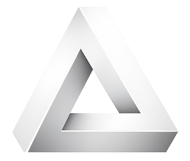
8. 3D, Depth, and Tactile Logos


Flat design is evolving into controlled dimensionality:
- Soft shadows
- Layering
- Subtle bevels
- Tactile surfaces
These logos feel more premium and physical without becoming cluttered. (Creative Bloq)
9. High-Contrast & Bold Color Systems
Color in 2026 is doing heavy lifting:
- High contrast palettes
- Bold accent colors
- Strategic use of black/white
This supports visibility across:
- Dark mode / light mode
- Mobile screens
- Accessibility requirements
(wix.com)
10. The Rise of “Logo Systems” Over “Logo Trends”
Here’s the uncomfortable truth most designers miss:
👉 There is no single dominant style anymore.
Instead, the real trend is:
- Systems thinking
- Adaptability
- Context-aware branding
As highlighted by Web Designer Depot, what we’re seeing isn’t a style shift—it’s pressure from technology, AI, and user behavior shaping how logos function. (Medium)
What This Means for Designers & Agencies (Actionable Takeaways)
If you’re running a design business like Logical Art Media, this is where you win:
1. Sell Systems, Not Logos
Offer:
- Logo + icon set
- Responsive variations
- Social + favicon assets
2. Design for 16px First
Start small → scale up (not the other way around)
3. Build Recognition, Not Decoration
Ask:
“Would someone recognize this instantly in a crowded feed?”
4. Inject Human Personality
Even in clean designs:
- Add nuance
- Add character
- Avoid generic AI outputs
5. Think Motion Early
Logos should:
- Animate
- Adapt
- Evolve
Logo design in 2026 isn’t about chasing trends—it’s about survival in a saturated, AI-driven world.
The brands that win will have logos that are:
- Instantly recognizable
- Flexible across platforms
- Emotionally resonant
- Technically adaptable
Everything else is just decoration.
Leave a Reply